The Human Account ExhibItion
Financial health exhibition design for Dalberg Design + the Bill & Melinda Gates Foundation
The Human Account project is an 18 month-long research project focussed on investigating the financial health of people in six developing countries (Pakistan, India, Myanmar, Nigeria, Kenya and Tanzania) which culminated with a launch event on October 25th, 2018 in NY. Alexia was brought in to champion her exhibition and experience design skills to help the team at Dalberg Design tell the human stories behind the 35 segments developed during the course of their research process.
Exhibition Design / Visual Design
EXHIBITION DESIGN COLLABORATORS
Melanie Kahl / April Soetarman
September-November 2018
Conceiving various opportunities for interaction
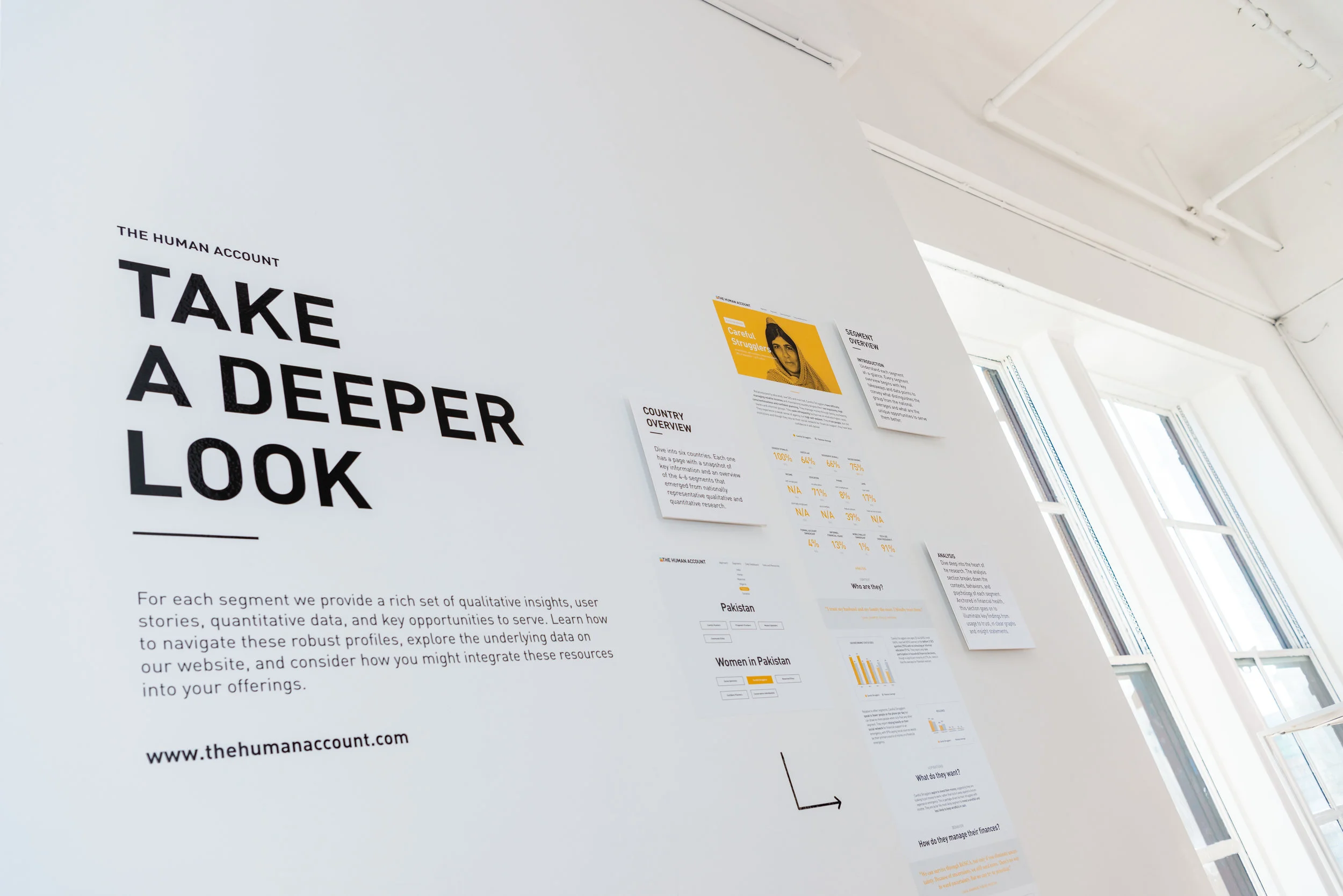
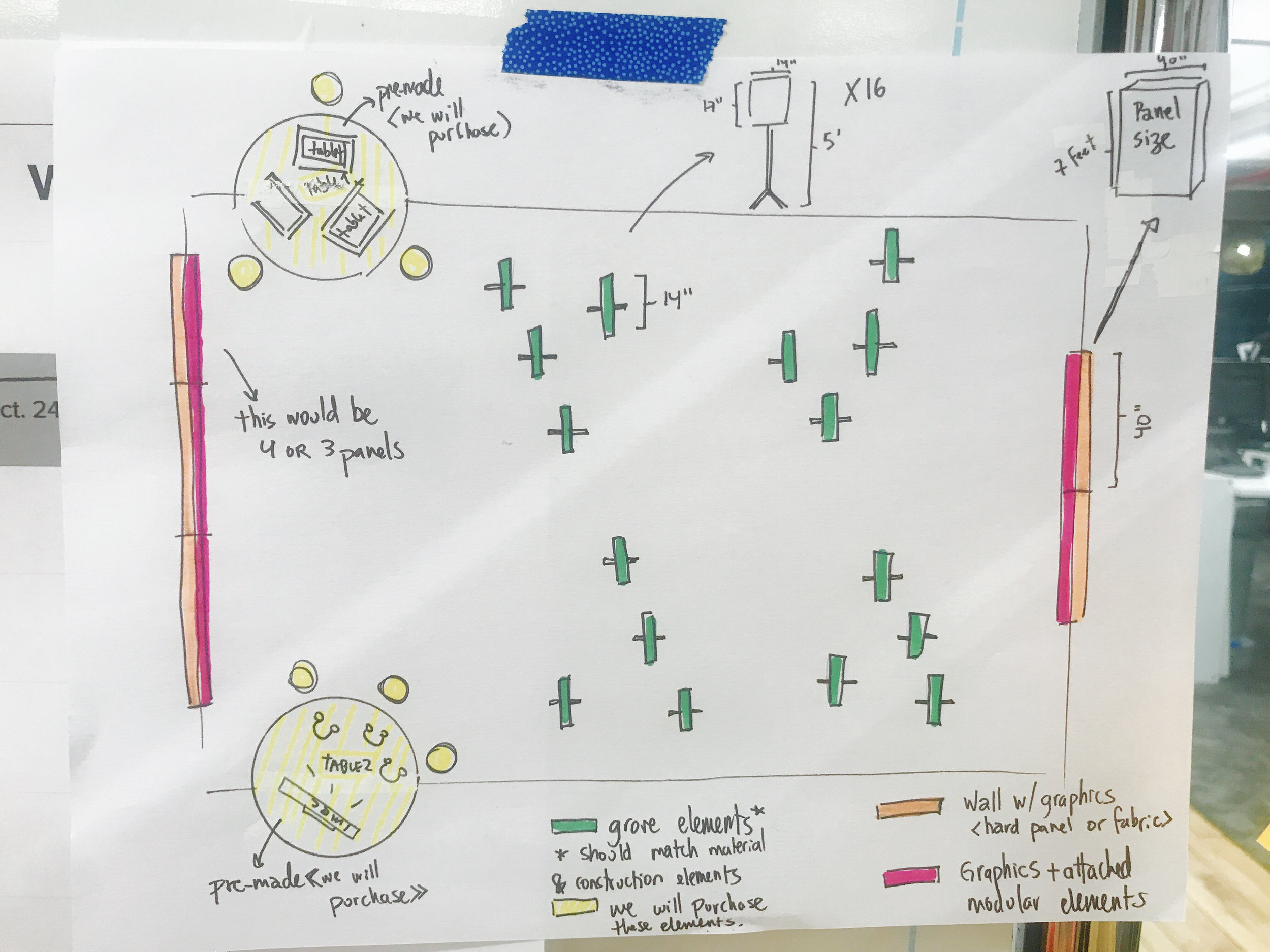
The exhibition welcomed visitors to learn about the project through 4 different zones. Each zone played a role in enabling the visitor’s in-depth exploration of the of the human stories behind each segment, along with access to robust data sets and the reserach framework behind the data. A set actions were designed as way-finding elements to guide the visitors through the various zones.
Alexia’s role
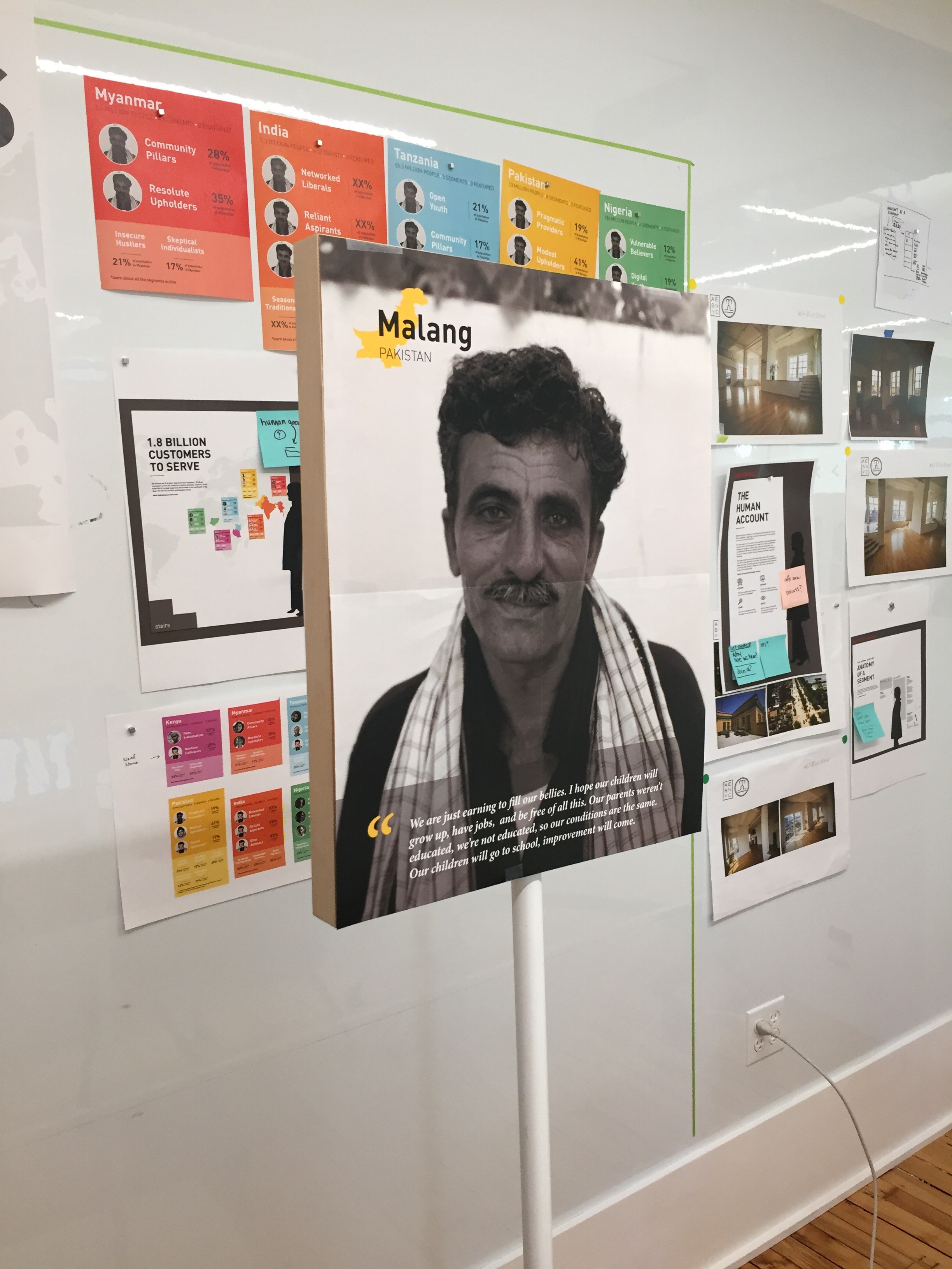
Under the guidance of Dalberg’s lead designer, Melanie Kahl, Alexia and April iterated and prototyped a handful of interactive proposals for the exhibit. Once a direction was established, Alexia’s main goal was to create a compelling visual and experiential strategy to bring to life the human stories behind each of the segments developed by the research team. The portrait stand elements—which were organically displayed through the central part of the space—allowed visitors to interact with the humans representing each of the segments. Each story included supporting data to understand their financial lives ande needs.
Ideation + production
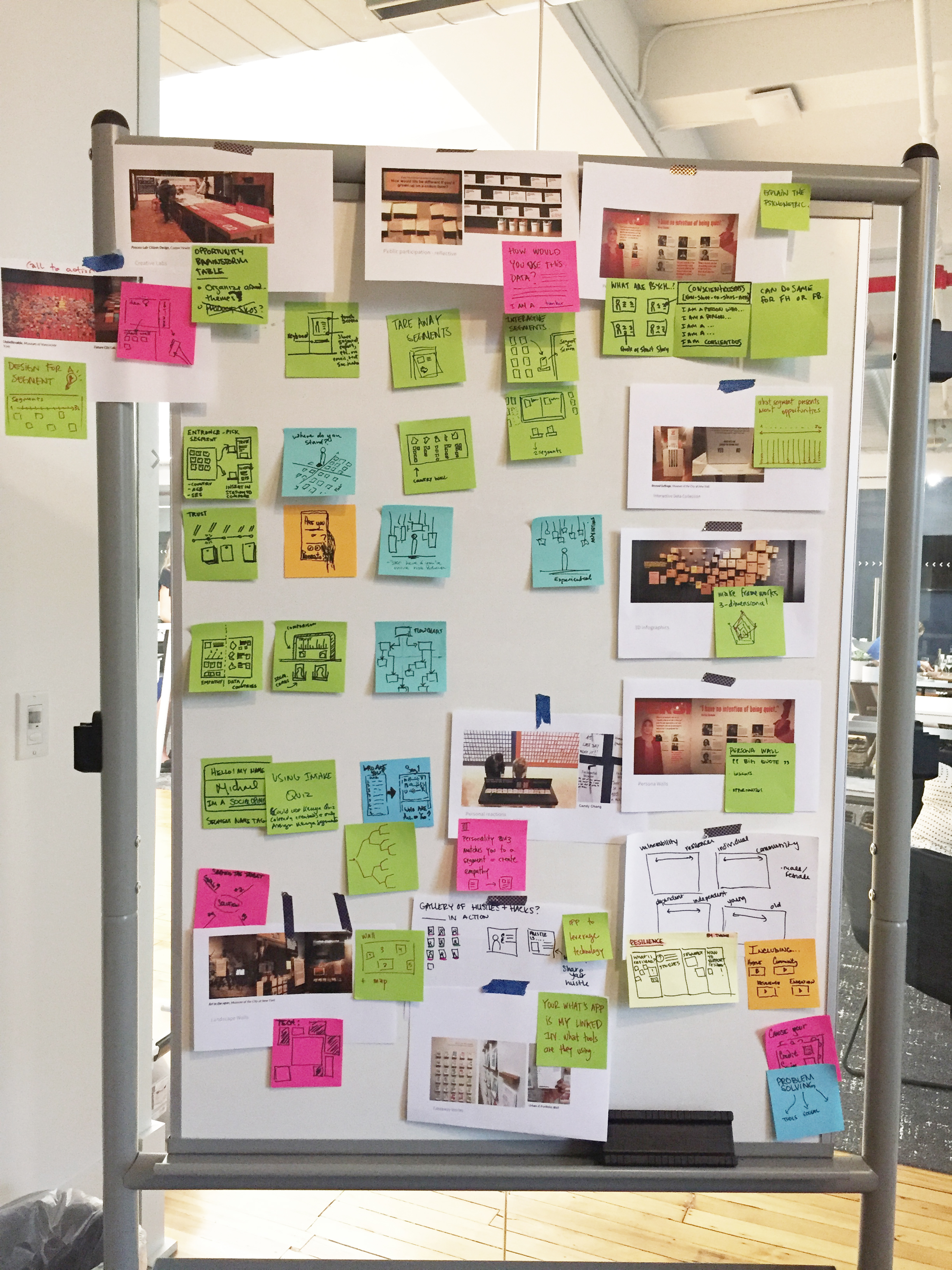
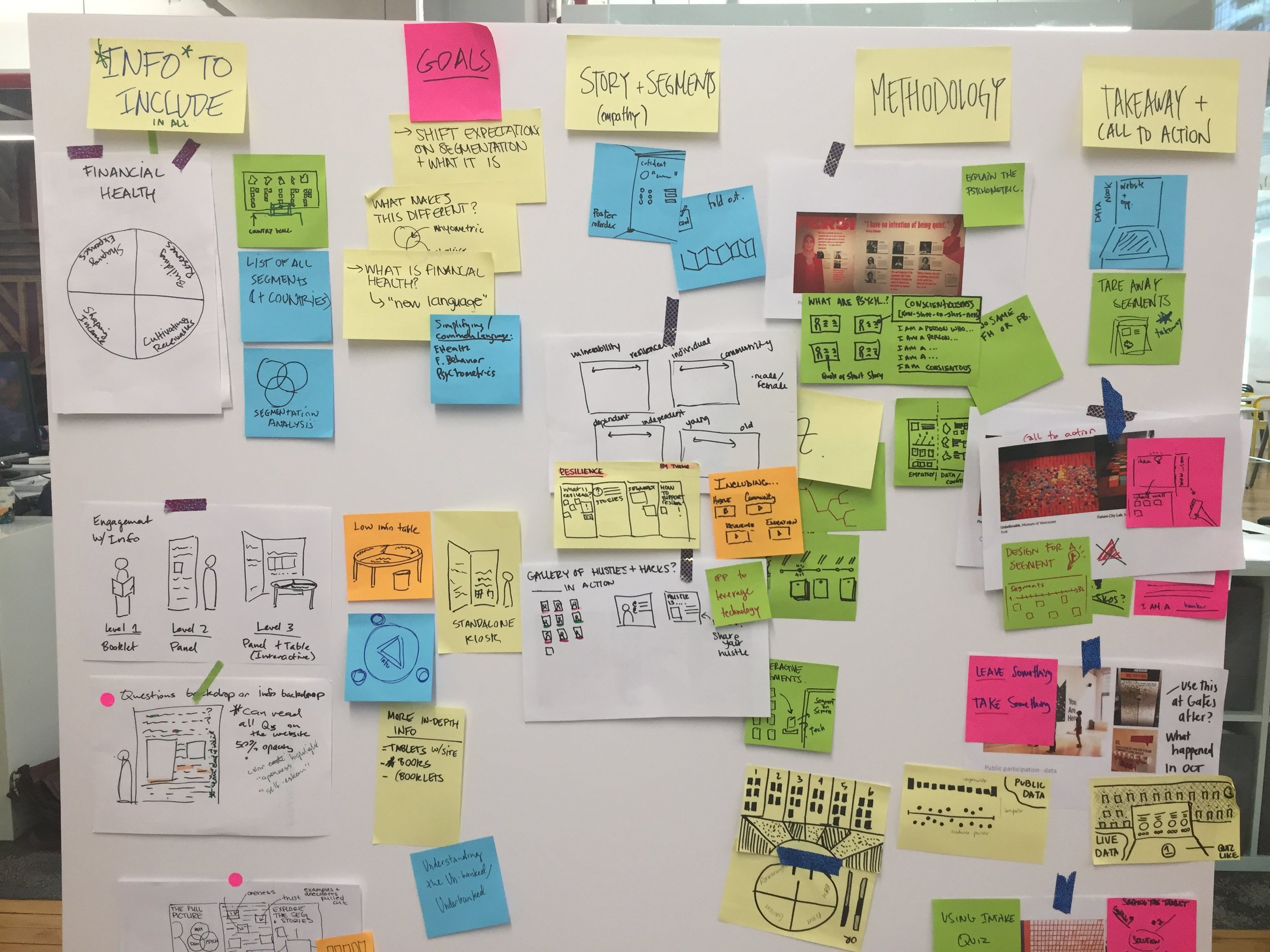
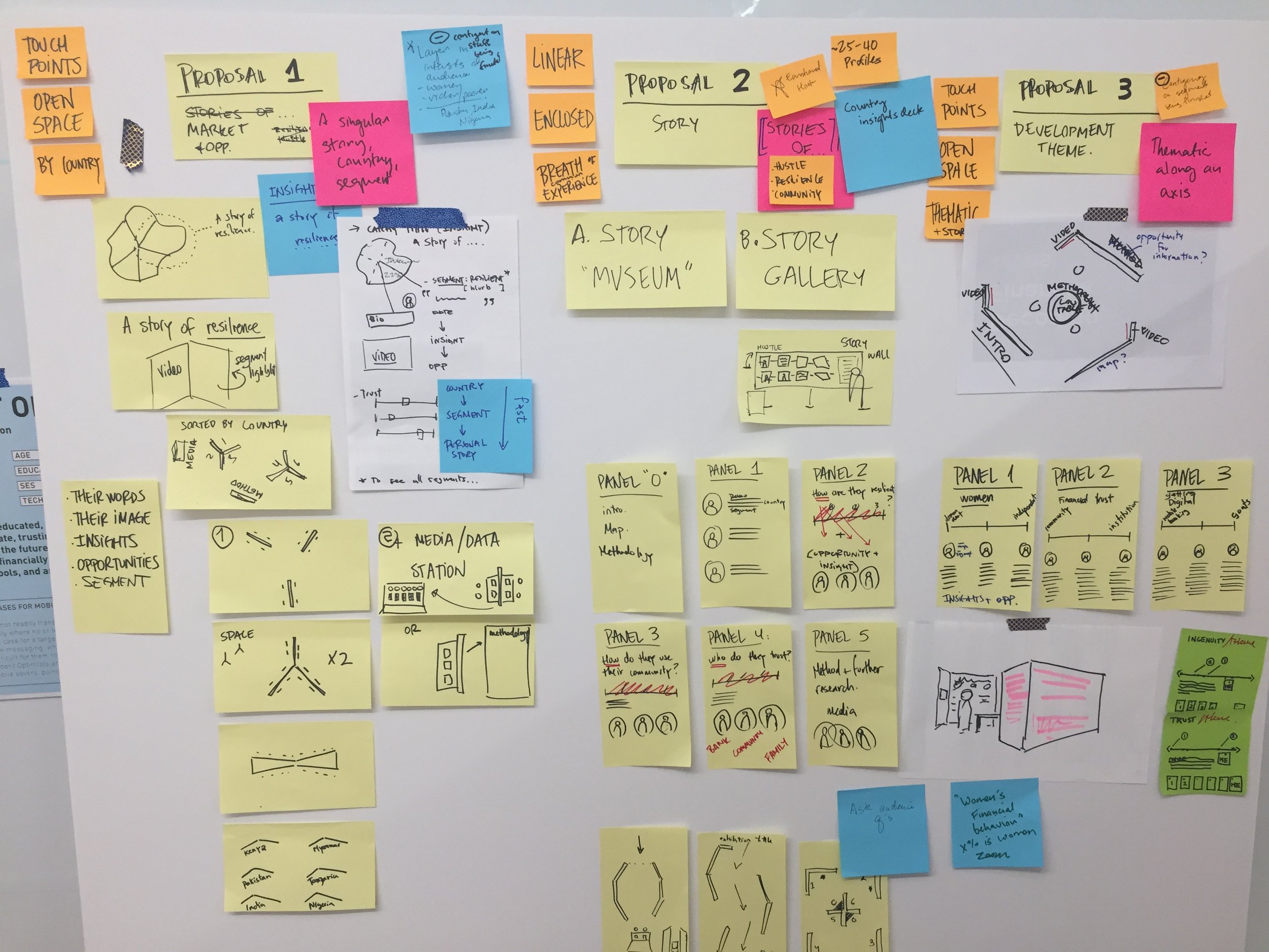
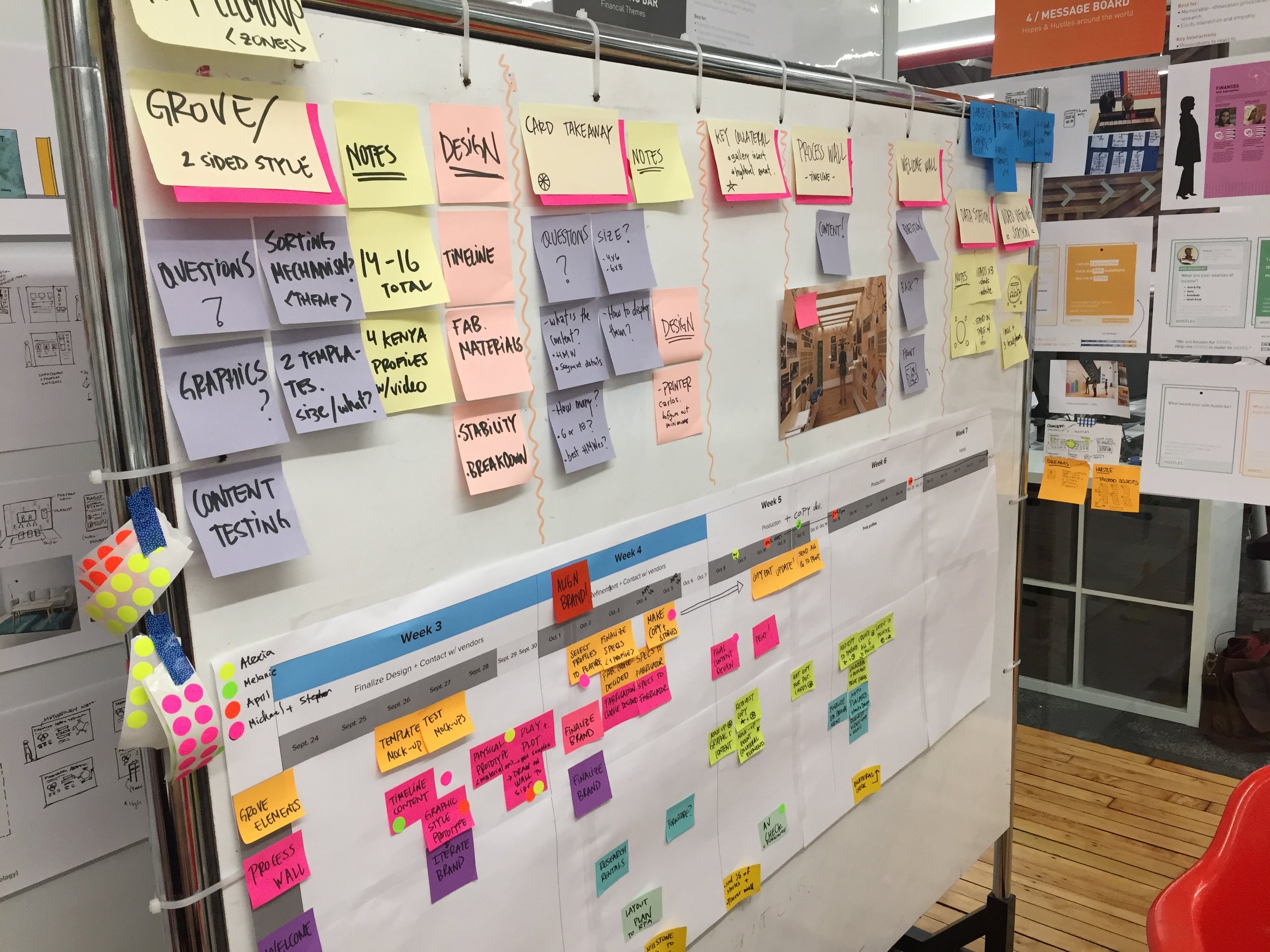
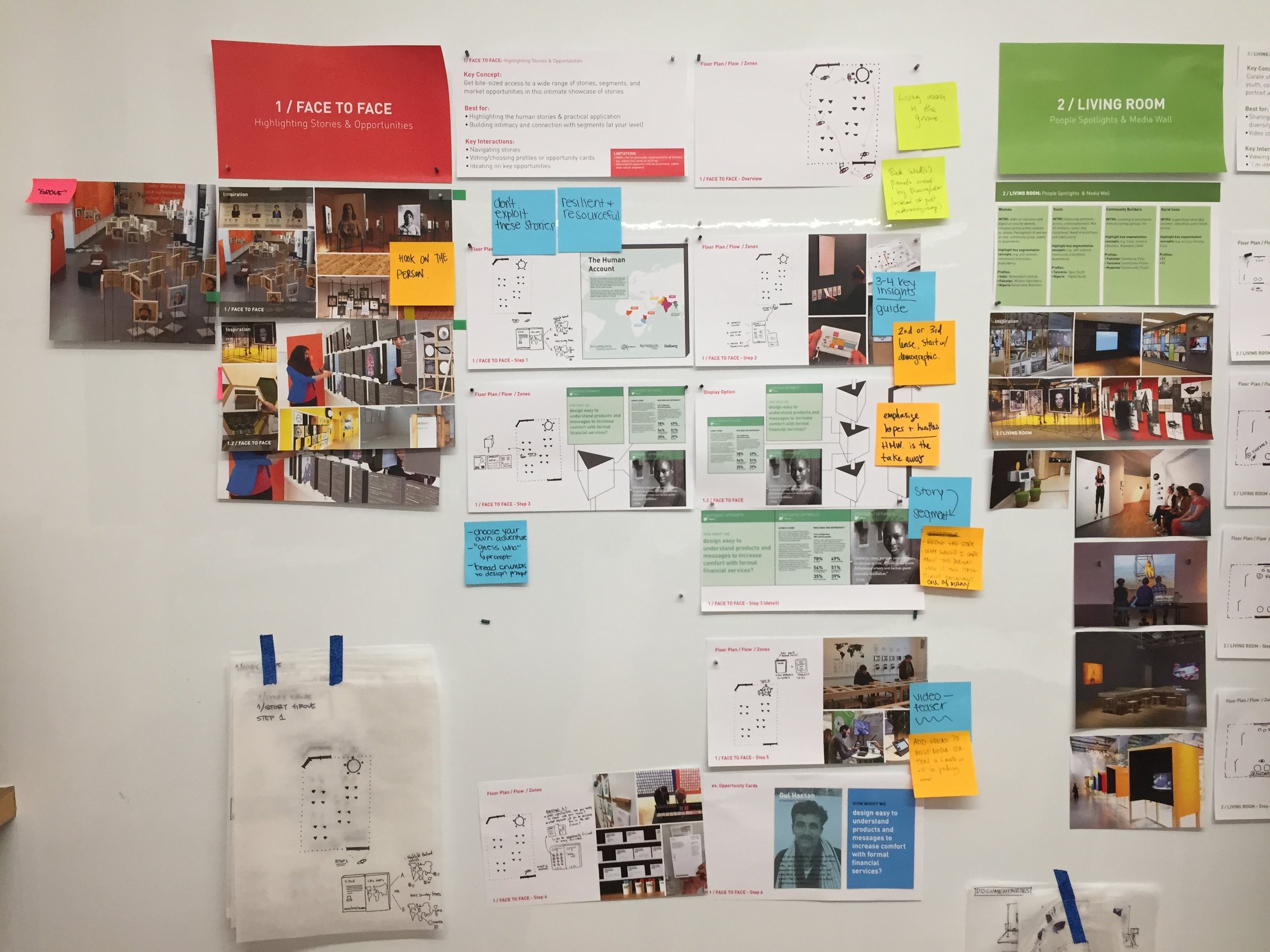
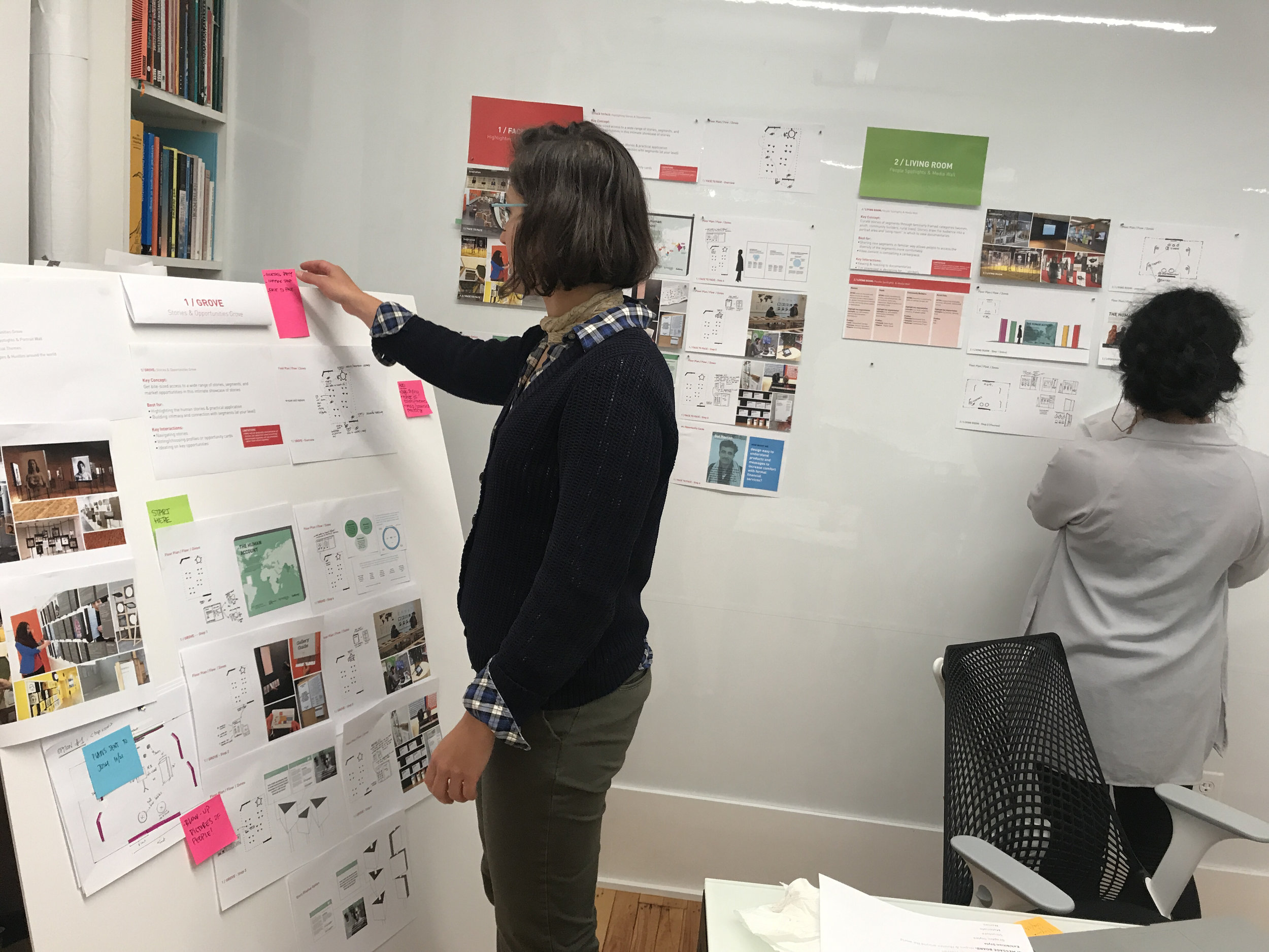
The process of ideation and iteration created 3 distinct directions, leading to the final structure of the exhibition to suit final event space. In the final exhibit it was important for the different zones to work in tandem in no specific order, so that visitors could flow freely through the space and explore the information at their own pace. Here’s a peak into the ideation brainstorm sessions, presentations, prototypes, and production charts.


